Configuring your brand colour, logo and welcome message
Make Voxinly look like your business. A short guide to the three settings that customers actually notice — brand colour, logo and the opening welcome message.

Customers form an impression of your chatbot in about three seconds. The brand colour says 'this belongs here'. The logo says 'this is them, not a generic bot'. The welcome message sets the tone for the whole conversation. These three settings do most of the heavy lifting on first impressions.
Where to find these settings
Log in to voxinly.com/admin and click Chatbot in the sidebar. The Configuration tab has everything you need.
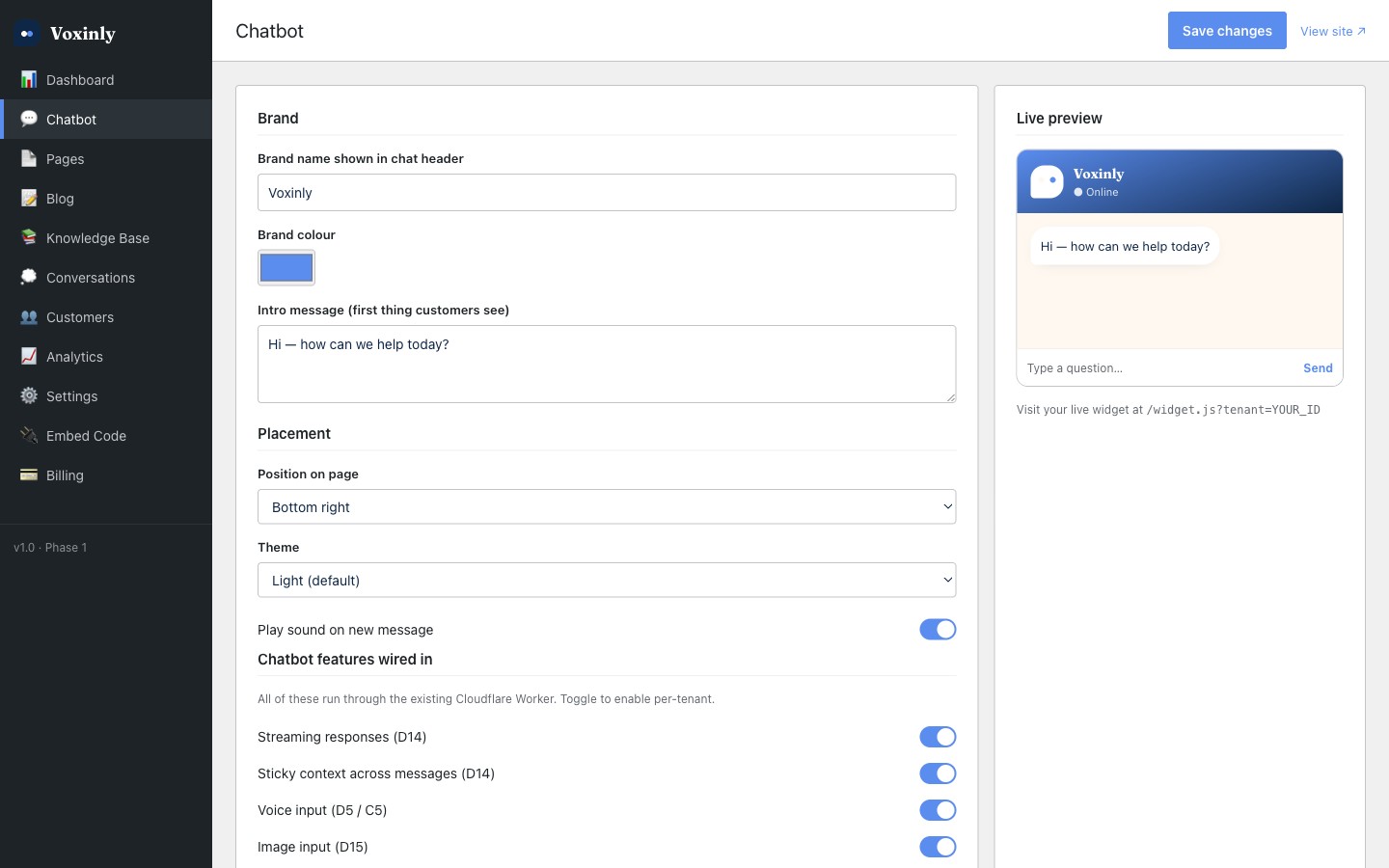
Brand colour
Pick your hex code
The brand colour input takes a six-character hex code (like #2E7D32 for a deep green). If you don't know your hex code, open your logo file in your photo viewer, pick the colour with the eyedropper, and copy the hex from the result. The colour picker in /admin/chatbot also gives you a visual swatch picker.
Mind the contrast
Your brand colour is used as a background under white text (the chat header) and as a button colour. Very pale colours (#FFE066 yellow, #FFDDDD pink) make text hard to read. If you've got a pale brand colour, use a darker shade of it for Voxinly — or switch to navy or black, which work for everyone.
Logo
Voxinly shows your logo as a small mark in the chat header — about 32 pixels square. That's the size of a thumbnail. Detailed logos (the ones with tagline and underline and registered mark) become unreadable at that size.
- Best: just your icon, the mark from your logo (the bit without the wordmark)
- OK: square version of your full logo
- Avoid: wide horizontal logos — they'll be crushed to fit the square
- Format: PNG with transparent background looks cleanest
- Size: anything from 64×64 up to 512×512 works. We'll resize it
Welcome message
The welcome message is the first thing inside the chat panel when a visitor opens it. The default is 'Hi — how can we help today?' which is fine. But a tailored welcome converts about 20% better in our experience, because it tells customers exactly what they can ask.
Examples that work
- 'Hi, I'm Dan's right-hand. I can quote callouts, book jobs, and answer Gas Safe questions. What's the job?'
- 'Hello — I can take you through services, prices for your postcode, and emergency callout times. What do you need?'
- 'Hi! I'm the Apex Roofing assistant. Ask me about flat roofs, slate, tile, or chimney work — I can give you a ballpark quote in under a minute.'
Examples that don't work
- 'Welcome to our website' — too generic, doesn't tell the customer what to do
- 'How may I be of assistance?' — too formal, doesn't sound human
- 'I'm an AI assistant, here to help' — leads with what you are, not what you do for them
Sound, position, opening hours
While you're in /admin/chatbot, three other small settings are worth a glance:
- Position: bottom-right is standard. Bottom-left works well on Arabic and Hebrew sites. Pick whichever doesn't clash with your existing buttons
- Sound: a gentle ping when a new message arrives. Most customers like this. Mute it if your audience is reading on the train
- Opening hours indicator: a small 'open now' / 'open at 8am' badge in the chat header that uses your business hours from /admin/settings